Posts

Showing posts from 2017

Ball Gifs

Image
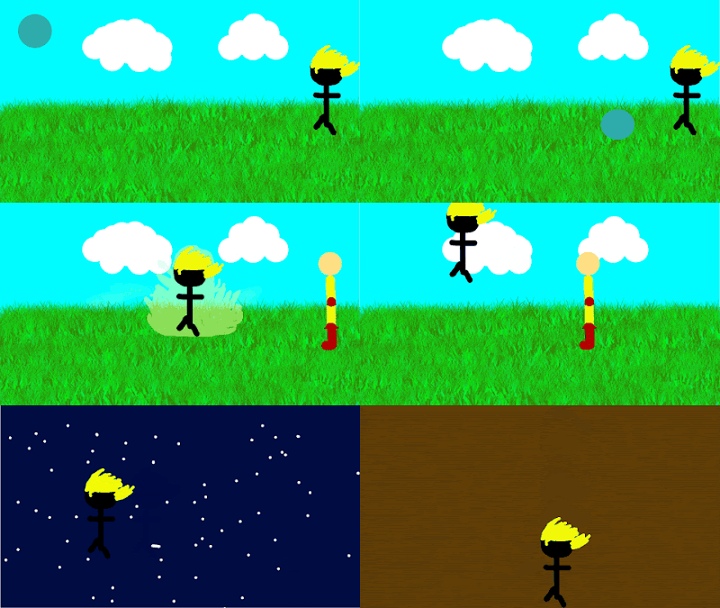
The point of these projects was to animate a little bit to get the hang of it and get familiar with Adobe Photoshop and with the types of animation there is. The process was a little slow first we had to make an outline of where the ball would go. Second we had to make multiple copies of the ball and make them have invisible. Then we had to take the frame pictures and turn the current one invisible and the next one visible over and over until we finished. Through out these projects I learned that photoshop could be used to create animations. If I had to do this differently i would make it less chunky and more smooth. I would keep the animations the same. 

Elevator pitch

Hello my name is Greyson Gibbs would you mind if I tell you about myself. I am in the e-Communication 21century program at Olathe Northwest high school. I have always wanted to be a videogame designer or animator. I am really good with computers and almost any type of technology. My passion is to work in the technical department. Also I work really well with other people no matter how difficult they are. I can keep calm under pressure, I do whatever it takes to get my work done. If you would like to contact me you can email me at greysongibbs@icloud.com.

Anatomy of Typography

Image
The project was to analyze the anatomy in letters. We had to find 10 different typefaces on our name. If I had to do one thing differently I would find more difficult Typefaces to recognize. First what we had to do was type our name on the type line then analyze the different parts of it.

color logos scheme

Image
Analogous colors This logo uses the analogous colors of orange and pink. I think they used the colors because they go well together. This logo uses the analogous colors of  red and yellow. I think they used these colors so the logo stands out. Complementary colors This logo uses the Complementary colors of blue and purple. I think they used these colors because it compliments the food This logo uses the Complementary colors of red white and blue.  I think they used this is because it's an american favorite. Warm colors This logo uses the warm colors of red yellow and white. I think they used these colors because it gives a feeling of fresh warm food. This logo uses the warm colors of yellow and orange. I think they used these colors to make you think of warm clothes Cool colors This logo uses the cool colors of blue and white. I think they used these colors to remind you of a

Color Wheel

Image
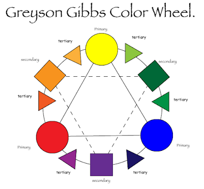
My project was to make a color wheel. I made this color wheel with adobe illustrator. In order to make this I had to learn how to use adobe illustrator and all of the tools in it. the tools that I used in illustrator were the ellipse tool, the polygon tool , and the type tool. One of the techniques I used is Alt left click and move that command makes an exact copy of whatever you use it on. The Primary colors are blue, red, and yellow which make up all of the secondary colors green, purple, and orange. Triad colors are the colors in between a primary and secondary color. This project went well i didn't have any problems. Next time I would try to find more exact colors. 

Sidewalk chalk group activity

Image
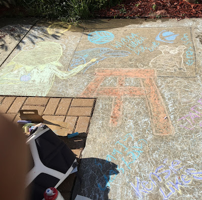
My team was really fun we had lots of fun doing the sidewalk chalk drawing. I was on a team with three other people we all had some creative ideas. At first we didn't really talk much but after a while we started talking. While we were sketching ideas for our symbols we started drawing random symbols that represent us. We all had different personalities so our symbols were very different.     We decided to make our symbols with their respective colors. We chose the symbols that best represent all of us then we combined it all into one big painting. With the symbols we had made we decided to use all the symbols we wrote down or until the square was full.      With the team experience I wish I could have thought of more to draw. This project was really fun to all of us. We really worked well as a group we had a lot of fun